In finishing “The Secret of Sterling House,” I thought I would do the illustrations later when I couldn’t think of anything to draw. Years went by before I stepped into independent publishing. Only then did I realize I had not really finished my book, just done other art instead.

Wise people say, “Know what you want.” Well what did I want this book to be? I had to decide. I wanted it to be the best it could be. That meant I had to finish the illustrations. It took me three whole days but I did it! My favorite time to draw was actually in church, listening to the preacher. For some reason I like to draw and listen, not watch. I guess it keeps my mind from going to all the dark places it finds when I am very focused. And yes, I can listen and remember, probably better than if I just sit there. I cannot write and listen and I cannot listen to music and do anything except exercise or manual labor.

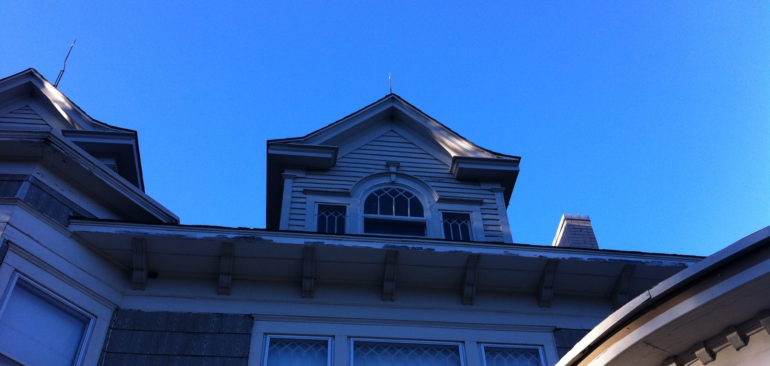
I enjoyed doing the drawings. I had grown a lot as an artist in the years since I had finished the book. I had also moved to a real Victorian house and was finally living in my dream. Many of the pictures I re-did and many I touched up. I always had difficulty drawing profiles so last year I decided to learn and I studied Tasha Tudor books and practiced until I could do it and I understood the facial structure of children’s profiles. Now I used my new “power” to make more beautiful pictures for my book. When done I had 35 pictures that I was happy to have drawn. They were the music for my words.

In the middle of this I realized it wasn’t simply going to be done in a couple of days. It was going to take over a week. I knew I would have to stay balanced and healthy for my family. I was home with my children for the summer. I needed to work, but also be there with them, cook meals, take breaks, exercise, shower, etc. I can get very focused and forget all these things and it is not good. It leads to burnout faster than a street race on a Friday night.

When done it took another day to scan everything in and work it all through Photoshop and this was the most frustrating work! I do not understand why my drawing on white paper suddenly becomes so ugly when scanned. The beautiful white background is grey, my lovely subtle graphite strokes become harsh and dirtied by spots and marks. Ugh. Since the dawn of photography humans have wanted a camera as good as the eye, we still aren’t close to it. My scanner, a nice Epson seems to find the marred edges, erased ghosts of pencil marks, smudges and spots and magnifies them! When I go to adjust levels I can pick from washed-out, or harsh and dark. When I print its a whole other story, it could look like I hadn’t adjusted levels at all! And it’s black and white! I’m not even dealing with color separation, RGB, CMYK, or other stuff! I spend HOURS with the clone stamp cleaning up my drawings, making them look like they already look to me before I put them on the scanner. Its such a waste of my energy! Alternately I could lasso everything and delete the background but this also takes hours and I often lose beautiful shades and fineness of lines. I did find a better way, but it was after all this hard work. Turns out I can add a layer mask and then bring the drawing to the front. I’ll try it next time, but it seems like a lot of work too. And I still have to adjust contrast and brightness and I feel that that always dances a fine line on what the drawing should look like.

Then, I embedded a picture into my book manuscript in Word. (Oh yeah, I had already worked two days on formatting the book from a double-spaced document a publisher wanted to what the book actually would look like. I’ll post a tutorial on this later. It took hours of research and editing! Then I printed it. It wasn’t dark enough! I went back to photoshop and changed all the illustrations and printed them to see how they would look. This took a while. Another day gone. The next day I sat down with a chapter list and plugged each of the 35 illustrations into their rightful places. The long landscape illustrations I put in, then turned inside my document (a mistake I would later regret) because I could not get gutters to work how I wanted. The frontispiece picture of the grand house I cut in two and set the type in in Photoshop. Controlling the type and the illustrations was not easy. I missed having inDesign! (I remember when it was Pagemaker!) I was doing the best I could with what I had.

Then I pressed the buttons to convert to PDF, uploaded to Create Space and “Hey, Presto!” There were problems!

Next I will convert my document to PDF over and over for four hours trying to fix everything and figure out why my long pictures were going haywire. I will also realize I don’t have a cover image or design! Will I ever be done?

